Neumorphism/03
12.07.2021
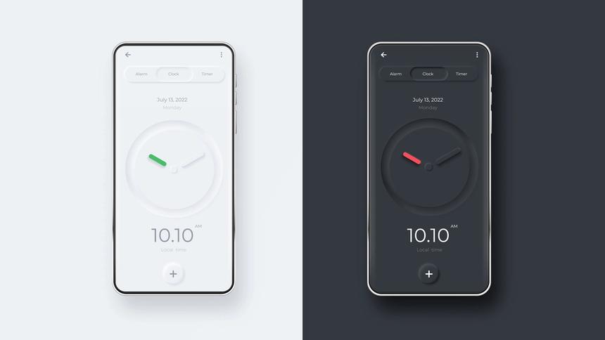
What in the hell is neumorphism? Early on in my journey into web development, I found myself asking the same question as I saw it pop up on the Twitter and Instagram feeds I was glued to. The mockups and images I was seeing were familiar, sort of, but the word was new (and made up). Turns out, neumophism, much like glassmorhpism and other -isms, are just fancy words for trends where UI designers bring a bit of a 3d element into their designs. Neumophism is a bit unique in that the idea is to create the feeling of components or elements pushing through the page like in the example below.
Dev studies?
This captivated my attention as I have worked in the 3d rendering/CGI world for the better part of the last decade. I fell in love with making 2d images and graphics come to life and so I was naturally drawn to this trend. this particular style was interesting to me because it uses perceived shadow play to create the effect with a highlight on the "light-exposed" side of the element and a shadow on the "nonlight-exposed" side of the element. After looking at a few images and examples I decided to pull out the notebook and do a bit of studying.
In the world of 3D design, studies (or examining a technology, material, or effect) are a common practice for artists in their free time as a means of creating or better understanding how to achieve the desired effect or realistic rendering. I asked a good friend that has been a developer for a while if this practice was common in software and web development and he seemed to have mixed experiences. It sounds like this practice may vary by discipline but I highly suggest you engage in micro studies as you see or find things that are particularly interesting that you don't fully grasp. I have been doing this for my entire adult life and it has paid off in major dividends for a wide variety of subject matter.
Hands-on with neumorphism
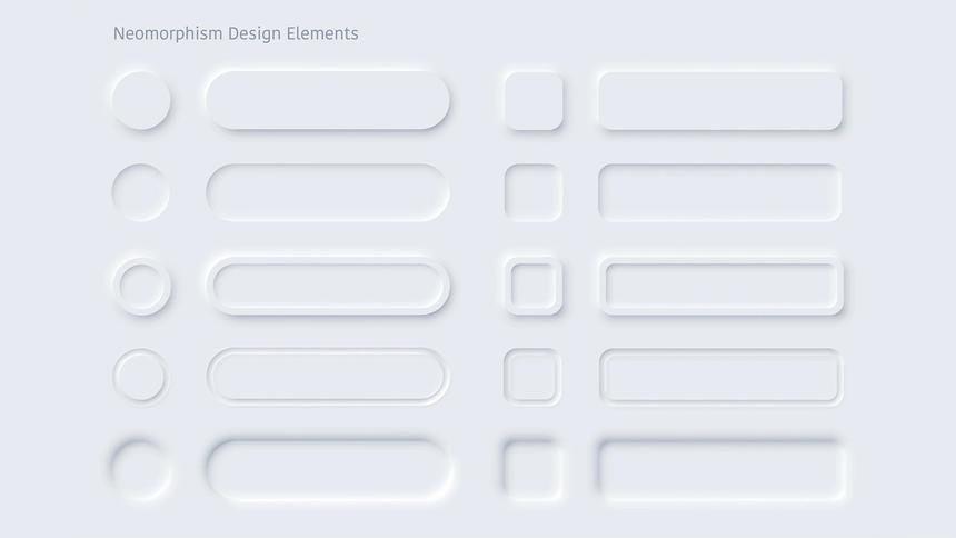
In any case, I set out to experiment a bit with neumorphism in a code pen project that ultimately turned into a fully-fledged CSS developers tool. You can find the CodePen here and the full app here. In doing some initial research and looking at other generators out there I was surprised to
see how believable some of the effects could be. While technically inaccurate in terms of light fall-off and reflection, I really liked what I saw. I started implementing some neumorphic elements in some of my own small projects and ultimately built the tool that I linked to above.
What I did notice, and why I ultimately built Better Neumorphism, is that all of the generators I saw were either limited to single instances of highlight and shadow combos or used black and white to account for the highlights and shadows with varying opacity levels. I struggled with these two approaches for a few reasons.
My own take
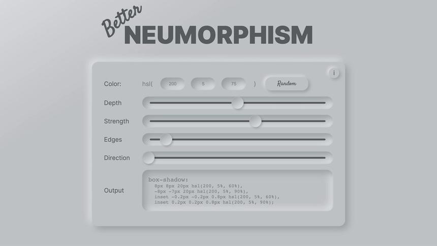
Let's start with the single highlight/shadow model. While using a box-shadow with negative x/y values for the highlight and positive x/y values for the shadow provides for some really nice effects particularly if you can dial in the strength of the two, it wasn't quite what I thought it should look like. The falloff from the surface of the element to the highlight or shadow was so abrupt that it wasn't believable to me. Nitpicky, I know, but what's a perfectionist to do? I took the approach of doubling up the box shadows and setting the latter 2 to inset shadows to accommodate for a bit of roll-off between the surface and the shadows. It took a while to find the right balance but ultimately I was very satisfied with the result.
If you use the tool, you can get a very extreme roll off of the inset shadows which create a more fluid or rounded look or it can be very subtle which tends to lend itself to a bit more realism from the original effect. See below and look at the edges of the UI and input fields/buttons.
Second, in the process of working with the inset shadows, I really struggled to get the feel of the highlights and shadows I felt was appropriate if I only used varying transparency levels of black for shadows and white for highlights. I needed actual variations of the target color and a formula that would calculate how dark or light those variations needed to be. The obvious answer for me was to control the highlights, shadows, and base color using HSL values. HSL allows for manipulation of only the luminance value independent of the actual color and saturation for a very cohesive end result.
In the end
All that was left was to add a bit of javascript so the effect could be tailored and viewed in real-time as changing a series of numbers one at a time is not only mindnumbing but rather un-intuitive. The end result is a tool that is a joy to use, fun to play with, and makes getting exactly what you are after a breeze.
So because I took the time to do a bit of a dev study on something I saw on Instagram, I was able to learn something new, flex my javascript skills, and end with a pretty useful tool for later. Education is the goal and generally, I find when doing projects like this I often get that in spades. Anyway, I hope you dig the tool and my explanation of it. I was really chuffed to see the CodePen project get picked up by the legendary CSS guru, Kevin Powell, in his weekly newsletter. If it's good enough for him....it's good enough for me I guess.
As always, if you have any questions or want to get in touch please drop me a line and I wish you all happy coding!
Cheers,